The Atomic Workflow — People, Process, And Making Design Systems Happen

Email Newsletter
Weekly tips on front-end & UX.
Trusted by 182,000+ folks.
 Register for Free
 Celebrating 10 million developers


 Custom Web Forms for Angular, React, & Vue. Your backend.
We are all trying to figure it out: how do we design flexible and future-proof responsive websites without reinventing the wheel every time a new requirement comes in? You’ve heard of atomic design, but how do we actually make it work in real-life? Let’s figure it out. We’ve teamed up with Brad Frost to set up an eBook bundle with the brand-new Atomic Design and our lovely Smashing Book #5 — available in ePUB, Kindle and PDF. Good things come in pairs! Get the bundle, and save 50% off the regular price. — Ed.
Talk is cheap. And up until now, we’ve been doing a whole lotta talkin’. That’s not to say it hasn’t been productive talk! After all, we’ve discussed the importance of modular thinking, we’ve learned a methodology for crafting deliberate UI design systems, and we’ve showcased tools for creating effective pattern libraries.
But here’s where the rubber meets the road. Where we roll up our sleeves and put all of this theory into practice. Where we get stuff done. This chapter will tackle all that goes into selling, creating, and maintaining effective design systems. You ready? Let’s go.
It’s People!
The not-so-secret secret about creating effective design systems (or doing any great work, really): it all comes down to people truly collaborating and communicating with one another.
If this is such common knowledge, why aren’t we constantly hearing thousands of success stories from around the world? I’ll let Mark Boulton explain:
"The design process is weird and complicated, because people are weird and complicated." — Mark Boulton
You can have all the right technologies in place, use the latest and greatest tools, and even have extraordinarily talented individuals on board, but if everyone involved isn’t actually cooperating and communicating with one another then you’re not going to create great work. It’s as simple as that. That’s not to say you can’t create good work, but more often than not you’re going to create one of the many disappointing shades of bad work.
Establishing and maintaining successful interface design systems requires an organization-wide effort, and this chapter will discuss how to overcome human beings’ many quirks to make them happen.
When To Establish A Design System
So when’s the best time to establish an interface design system? Short answer: now.
Design systems and their accompanying pattern libraries are often created in conjunction with a new design or redesign project, replatforming effort, or other initiative. Piggybacking off another project is a great way to sneak a pattern library into your organization.
That being said, creating a design system and pattern library doesn’t necessarily need to coincide with another project. If you can convince your clients and stakeholders to pony up the cash and resources for a dedicated design system project, then good on you!
How exactly do you sell a design system to your clients, bosses, colleagues, and stakeholders? Put on your business hat, because we’re going to tackle that in the next section!
Pitching Patterns
Introducing a new way of doing things is no easy task, as it requires changing people’s existing mentalities and behaviors. Getting stakeholders and clients on board with establishing a design system involves constant education, in addition to a bit of marketing savvy.
First things first. It’s necessary to introduce the concept of interface design systems to your clients, colleagues, and stakeholders. Explain what these design systems are and the many ways they can help the organization. We’ve discussed these benefits throughout the book, so you can explain how design systems promote consistency and cohesion, speed up your team’s productivity, establish a more collaborative workflow, establish a shared vocabulary, provide helpful documentation, make testing easier, and serve as a future-friendly foundation. Who can say no to all that!?
Alas, I’ve found that I can hype design systems until I’m blue in the face, but the suits don’t always see things through the same lens as the people on the ground. A simple reframing of the question helps immensely. It’s much more effective to simply ask, “Do you like saving time and money? Yes or no?” If the answer to that question is no, I’m afraid you have way bigger problems than selling a design system. If the answer is yes, then you can pitch the benefits through the lens of time and money. Let’s try this out, shall we?
- Design systems lead to cohesive, consistent experiences. That means users master your UI faster, leading to more conversions and more money based on the metrics your stakeholders care about.
- Design systems speed up your team’s workflow. Rather than reinventing the wheel every time a new request comes through, teams can reuse already established UI puzzle pieces to roll out new pages and features faster than ever before.
- Centralizing UI components in a pattern library establishes a shared vocabulary for everyone in the organization, and creates a more collaborative workflow across all disciplines. With everyone speaking the same language, more time is spent getting work done and less time is spent dealing with superfluous back-and-forth communications and meetings.
- Design systems make cross-browser/device, performance, and accessibility testing easier, vastly speeding up production time and allowing teams to launch higher-quality work faster. Also, baking things like accessibility into a living design system scales those best practices, allowing your interfaces to reach more users while reducing the risk of you getting sued!
- Once a design system (with accompanying pattern library) is established, it serves as a future-friendly foundation for the organization to modify, tweak, extend, and improve on over time. Doing some A/B testing? Roll the lessons from those tests into the living design system. Made some big performance optimizations? Roll them into the living design system! The living part of living design systems means they can always adapt to meet the future needs of the organization, saving time and money all the while.
Framing things in terms of time and money helps the people controlling the purse strings understand why a design system is a worthwhile pursuit. With any luck, these conversations will translate to a concrete commitment from the organization (read: allocating real time and money) to make a design system happen.
Show, Don’t Tell: The Power Of Interface Inventories
If only getting buy-in were as easy as having a few well-timed conversations with the right people. Maybe you’re savvy enough to seal the deal with talking points alone, but for us mere mortals words aren’t enough. Sometimes you need more. Sometimes you need to make them feel the pain.
Enter the interface inventory.
Many are familiar with the concept of a content inventory. Content audits are usually performed in the early stages of a website redesign process to take stock of all a site’s content. It’s a tedious process involving spreadsheets and caffeine, but all that hard work pays off. By the end of the exercise the organization’s content is laid out on the table, giving teams valuable insights into how to handle their content as they tackle the project.
An interface inventory is similar to a content inventory, only instead of sifting through and categorizing content, you’re taking stock of and categorizing all the components that make up your user interface. An interface inventory is a comprehensive collection of the bits and pieces that make up your user interface.
Conducting An Interface Audit
How do you go about conducting an interface audit? How do you round up all the components that make up your UI? The simple answer is screenshots. Lots of them! Creating an interface inventory requires screenshotting and loosely categorizing all the unique components that make up your user interfaces. While that’s a relatively straightforward endeavor, there are some important considerations to keep in mind to make the inventory as useful as possible. Let’s go through the process for creating a successful interface inventory.
Step 1: Round Up The Troops
I’ve encountered many ambitious designers and developers who have taken it upon themselves to start documenting their organization’s UI patterns. While I certainly applaud this individual ambition, it’s absolutely essential to get all members of the team to experience the pain of an inconsistent UI for them to start thinking systematically.
For the interface inventory to be as effective as possible, representatives from all disciplines responsible for the success of the site should be in a room together for the exercise. Round up the troops: UX designers, visual designers, front-end developers, back-end developers, copywriters, content strategists, project managers, business owners, QA, and any other stakeholders. The more the merrier! After all, one of the most crucial results of this exercise is to establish a shared vocabulary for everyone in the organization, and that requires input from the entire team.
Step 2: Prepare For Screenshotting
The interface inventory exercise generates a ton of screenshots, so naturally you’ll need software to capture and display those screenshots. Some possible tools include:
- PowerPoint or Keynote
- Photoshop or Sketch
- Evernote Web Clipper
- Google Docs or Microsoft Word
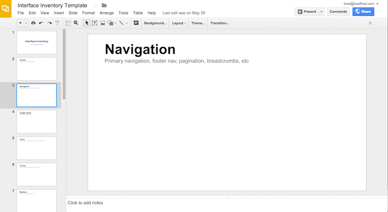
- Google Slides (If you’re interested, I’ve created a Google Slides interface inventory template)
Ultimately, it doesn’t really matter what tool you use, but everyone should agree on a single tool to make it easier to combine at the end of the exercise. I’ve found online slide-building software like Google Slides to be very effective as it provides a canvas for free-form image positioning, they’re chunked out into slides for easier categorization, and they’re web-based so can be shared with ease.
Step 3: Screenshot Exercise
Get your screenshotting fingers ready because it’s time for the main event! The interface audit exercise involves screenshotting and categorizing all the unique UI patterns that make up your experience. Bear in mind this exercise doesn’t mean capturing every instance of a particular UI pattern, but rather capturing one instance of each unique UI pattern.
Assign each participant a UI category. You may need to pair people or have participants document multiple categories, depending on how many people are taking part in the exercise. Once again, it’s helpful to have as many participants as possible since more people screenshotting will result in more thorough documentation.
What Patterns To Capture
What interface element categories should be captured? Obviously, the categories are going to vary from interface to interface, but here are a few categories to start with:
- Global elements: components like headers, footers, and other global elements that are shared across the entire experience.
- Navigation: primary navigation, footer navigation, pagination, breadcrumbs, interactive component controls, and essentially anything that’s used to navigate around a user interface.
- Image types: logos, hero images, avatars, thumbnails, backgrounds, and any other type of image pattern that shows up in the UI.
- Icons: icons are a special type of image worthy of their own category. Capture magnifying glasses, social icons, arrows, hamburgers, spinners, favicons, and every other interface icon.
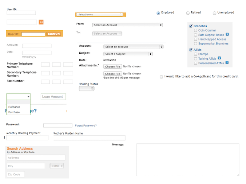
- Forms: inputs, text areas, select menus, checkboxes, switches, radio buttons, sliders, and other forms of user input.
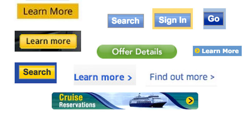
- Buttons: buttons are the quintessential UI element. Capture all the unique button patterns found throughout the experience: primary, secondary, big, small, disabled, active, loading, and even buttons that look like text links.
- Headings:
h1,h2,h3,h4,h5,h6and variations of typographic headings. - Blocks: also known as touts, callouts, summaries, ads, or hero units, blocks are collections of typographic headings and/or images and/or summary text (see Nicole Sullivan’s write-up about the media object as an example of a block).
- Lists: unordered, ordered, definition, bulleted, numbered, lined, striped, or any group of elements presented in a list-type format.
- Interactive components: accordions, tabs, carousels, and other functional modules with moving parts.
- Media: video players, audio players and other rich media elements.
- Third-party components: widgets, iframes, stock tickers, social buttons, invisible tracking scripts, and anything else that isn’t hosted on your domain.
- Advertising: all ad formats and dimensions.
- Messaging: alerts, success, errors, warnings, validation, loaders, popups, tooltips, and so on. This can be a challenging category to capture as messaging often requires user action to expose.
- Colors: capture all unique colors presented in the interface. This category can be aided by fantastic style guide bootstrapping tools like CSS Stats and Stylify Me.
- Animation: animation is an elemental aspect of user interfaces, and should therefore be documented. This requires using screen recording software such as QuickTime to capture any UI element that moves, fades, shakes, transitions, or shimmies across the screen.
Again, these categories aren’t set in stone and will vary based on the nature of the user interface you’re dealing with. Of course, it’s important to add, subtract, or modify these categories to best fit your organizational needs.
Timing Is Everything
It’s important to set time limits on the screenshotting exercise to avoid going down a rabbit hole that ends up lasting all day. The amount of time you allocate will vary depending on how many people are participating, but I find between 30 and 90 minutes to be sufficient for a first pass of an interface inventory. Set a timer, throw on some Jeopardy! music (well, maybe not Jeopardy! music, but some other music that sets an upbeat mood for the exercise), and have the participants concentrate on screenshotting the unique UI patterns they encounter.
Dig Deep
Which parts of the site should participants capture in the interface inventory? Short answer: everything. Any piece of UI that is or could be managed by your organization should be documented.
This is difficult as organizations tend to favor certain parts of the experience (cough homepage cough) over others. For example, people working on an e-commerce website tend to focus on the core shopping experience, even though areas like customer support, FAQs, sizing charts, 404 pages, and legal terms are also extremely important to the user experience. Remember, users perceive your brand as a singular entity and don’t care about your organizational structure, tech stack, or anything else that might cause disparities in the UI. Encourage interface audit participants to be as thorough as possible during the exercise.
Step 4: Present Findings
The screenshotting exercise can be a bit overwhelming, so be sure the team takes a break after the exercise is complete. Get some food, grab some coffee, and stretch your legs for a bit. Once everyone’s feeling refreshed, it’s time to discuss what you captured.
Have each participant spend five or ten minutes presenting each UI category to the group. Here’s where the fun begins. Presenting to the group allows the team to discuss the rationale behind existing UI patterns, kick-starts a conversation about naming conventions, and gets the team excited to establish a more consistent interface.
Naming things is hard. It’s fascinating to hear the inconsistent names designers, developers, product owners, and other stakeholders all have for the same UI pattern. “Oh, we call that the utility bar.” “Oh, we call it the admin nav.” “Oh, we call it the floating action area!” This exercise is an opportunity to unearth and iron out disparities between pattern labels, and also establish names for previously unlabeled patterns. Don’t feel like you need to come to a consensus on patterns’ final names in the course of ten minutes; this exercise is simply meant to open up a broader discussion.
Once every category has been presented and discussed, all the participants should send their slides to the exercise leader. The leader will then combine everything into one giant über-document, which will soon become a wrecking ball of truth and justice.
Step 5: Regroup And Establish Next Steps
With the über-document in hand, it’s time to get the entire organization on board with crafting an interface design system.
Have you ever wanted to see a CEO cry? Laying bare all your UI’s inconsistencies is a great way to make that happen! One of the most powerful benefits of interface inventories is that you can show them to anyone, including non-designers and developers, and they’ll understand why inconsistent UIs are problematic. You don’t need to be a designer to recognize that having 37 unique button styles probably isn’t a good idea. Here’s your opportunity to make it crystal clear to stakeholders that approaching your UI in a more systematic way makes great sense for both your users and your organization.
In addition to selling the idea to key stakeholders, all the hard work and discussion that went into the initial interface inventory exercise should be translated into the seeds of your future design system and pattern library.
It’s very likely the initial exercise didn’t capture every unique UI pattern, so you may need to conduct another interface audit exercise to capture a more complete picture of your UI patterns. This may involve a large group again, but in reality a smaller, cross-disciplinary team will be going through the über-document and establishing next steps for the design system.
Once the gaps in the interface inventory have been filled, the working group can have some important conversations about next steps for the design system project. Some key questions for this group to cover include:
- Which patterns should stay, which should go, and which can be merged together?
- What pattern names should we settle on?
- What are the next steps to translate the interface inventory into a living pattern library?
Benefits Of An Interface Inventory
Creating an interface inventory can be quite an undertaking, but the benefits of making one are many:
- Captures all patterns and their inconsistencies: an interface inventory rounds up all the unique patterns that make up your UI. Seeing all those similar, but still different, patterns next to each other exposes redundancy and underscores the need to create a consistent, cohesive experience.
- Gets organizational buy-in: having a large, diverse group of disciplines participate in the exercise helps everyone understand the value of creating and maintaining a consistent user interface. Also, the interface inventory über-document can be a tremendously powerful tool for convincing stakeholders, bosses, and clients to invest in an interface design system.
- Establishes a scope of work: an interface inventory helps design teams determine the level of effort required to design and build each UI pattern as part of a design or redesign project. Which components will be relatively easy or difficult to convert into a responsive environment? What are the content, design, and development considerations around each component? An interface inventory enables teams to have important conversations that help establish a project’s realistic scope and timeline.
- Lays the groundwork to a sound interface design system: the interface inventory is an important first step for setting up a comprehensive pattern library. It’s essential to capture all existing UI patterns to determine which patterns will make the final cut in the living design system. The interface audit exercise also helps teams establish a shared vocabulary, which will be crucial for the success of the eventual design system.
Ask Forgiveness, Not Permission
So you’ve discussed the benefits of establishing a living design system with your stakeholders, and you’ve even created an interface inventory to show them the inconsistent train wreck that is the current UI. And yet, despite all your efforts, they still shoot down the sound idea of establishing an interface design system and pattern library. What’s a responsible web team to do?
Do it anyways.
Just how we build things like performance, accessibility, and responsiveness into our products and process by default, we should also create design systems by default. You don’t need to get the client’s blessing to follow your craft’s best practices. When you give stakeholders the option to say no to something, they will. So simply don’t give them that opportunity. Our job is to create great work for our clients and organizations, and interface design systems are a means to that end.
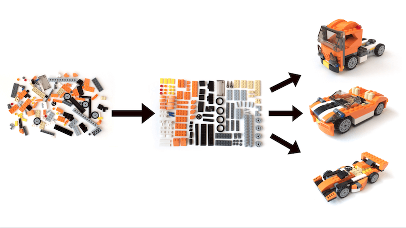
In fact, to create the whole, you need to create the parts of that whole. Our interfaces consist of smaller pieces, whether you pay those smaller pieces any mind or not.
You have a decision to make: focus solely on creating the whole while ignoring the parts, or spend some time organizing the parts to help you more efficiently create the whole. In his book Multiscreen UX Design, Wolfram Nagel wonderfully articulates these approaches using Lego bricks as an analogy.
One way to approach a Lego project is to simply dump the pieces out of the box onto a table, roll up your sleeves, then start building your creation.
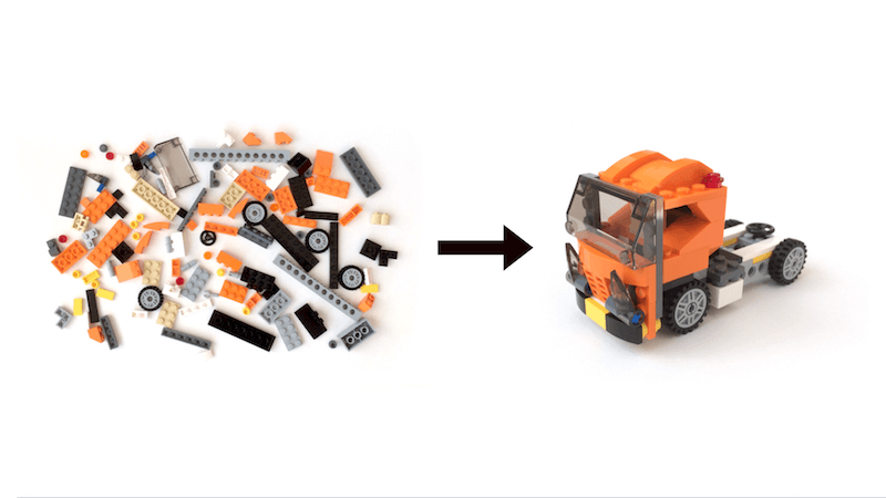
This approach to a Lego project is certainly a viable strategy, even if it is unapologetically haphazard. The only time you’d pay attention to the pile of bricks is when you’re sifting through it to find the specific piece you need.
This is not dissimilar to how many digital projects are approached. The client needs a website, so we jump in to designing and building it. The client needs a mobile app, so we immediately start building the screens of the app. Our gaze remains transfixed on the final product, and we rarely, if ever, glance at the underlying patterns that comprise our final UIs.
Of course, there is another way to approach your Lego and digital projects. Rather than diving headfirst into constructing the final work, you can take the time to take stock of the available pieces and organize them in such a way that they become more useful.
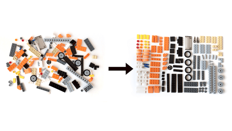
No doubt organizing takes time, planning, and effort. It doesn’t come for free. The fact that this configuring isn’t visibly represented in the final product may tempt us to say it serves as a distraction to the real work that needs to be done. Why bother?
By taking the time to organize the parts, you can now create the whole in a more realistic, deliberate, and efficient manner. Creating a library of your available materials allows you to approach the project in a more methodical way, and saves immense amounts of time in the process. Rather than rummaging through a haphazard pile of bricks and burning time reinventing patterns, you can create an organized system of components that will help produce better work in a shorter amount of time.
As far as your clients and stakeholders are concerned, the final product is still being produced. So long as you’re showing progress on the final work, you can decide how much of your internal process you’re willing to expose. The fact that you’re creating a design system to produce the final product is really of no concern to them; it’s simply a decision your team is making to create better work.
If you’re dealing with change-averse stakeholders, I say do what you need to do and tell them to pay no attention to what’s happening behind the scenes. Once you’ve successfully launched the project and the champagne has been poured, you can pull back the curtain and say, “Oh, by the way, we established a design system and pattern library so the team could collaborate and work more efficiently together.” It would be extremely difficult for them to argue against you now, especially if the project came in on time and on budget. If you’re really lucky, you can parlay the initial project’s success into a more official initiative within the organization to evolve your design system.
Of course, it’s preferable to get your clients, colleagues, and stakeholders excited about creating an interface design system, or at the very least get their blessing to pursue the project in a modular fashion. But I think it’s important to find ways to follow your craft’s best practices even when you’re faced with extreme organizational resistance.
(Re)Setting Expectations
You’ve put in a lot of hard work to sell the concept of a design system, but you still need to set stakeholder and team expectations before you roll up your sleeves and get to work.
When I say “set expectations” I’m really saying “_re_set expectations.” You see, we all bring our own experiences, opinions, and biases to a project. Our industry is still incredibly young, so many people working on web projects are coming from other industries with their own established Ways Of Doing Things™. Even people who have worked exclusively in the digital world have felt the baggage of industries past. Moreover, the guiding principles, best practices, and tactics of digital design are still very much being codified.
It’s ludicrous for anyone to utter the phrase, “This is how we’ve always done things” in an industry that’s only 25 years old. Unfortunately, we humans are creatures of habit, and stepping outside familiarity’s warm embrace is uncomfortable. We don’t like being uncomfortable. We must overcome our existing predispositions if we’re going to embrace our ever-shifting industry’s best practices and create successful digital work.
Redefining Design
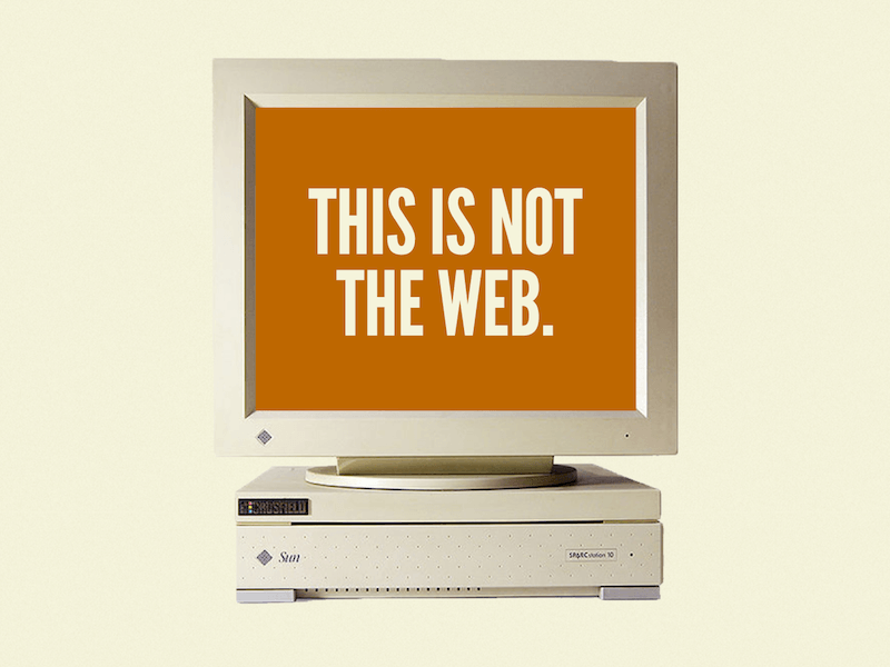
We’ve come a long way from simply transplanting print PDFs to the World Wide Web, but print design still casts a long shadow and continues to influence how things get done online.
Design in the print world focuses heavily on visual aesthetics. After all, you can’t do much more with a poster than look at it. To be clear, I’m certainly not implying print design is easy or one-dimensional; the world of print is steeped in nuance and craft. What I am saying is that the bidirectional and interactive nature of the web adds many more dimensions to what constitutes good design. Speed, screen size, environment, technological capabilities, form-factor, ergonomics, usability, accessibility, context, and user preferences must be considered if we want to create great work for this brave new digital world.
These additional design considerations are vital for creating great digital work, yet they are too often absent from our processes and workflows. Designer Dan Mall explains:
"As an industry, we sell websites like paintings. Instead, we should be selling beautiful and easy access to content, agnostic of device, screen size, or context." — Dan Mall
How did we get to the point where we sell and design websites like they’re static images? During the formative years of the web we created experiences meant to be consumed solely by desktop computers, which is understandable since desktops were really the only game in town. The real estate provided by desktop screens made the idea of simply translating a PDF onto the web feasible and enticing. So that’s what we did—and for a while it actually worked!
However, this didn’t come without consequences. This print-like perspective of the web reinforced the notion that web designs, like their offline counterparts, could and should look the same in every environment. It also kept the focus on how a web design looked rather than how it worked, ignoring all the unique characteristics of this rich new medium. Moreover, it strengthened the belief that we could apply the same linear processes used to create print work to our digital work.
Time went by, of course, and mobile exploded, technology improved, and the web become the incredibly large and diverse landscape we know today. Gone are the desktop-only days of yore, and in their place is a time of smartphones, dumb phones, tablets, phablets, netbooks, notebooks, e-readers, wearables, TVs, game consoles, car dashboards, and so much more.
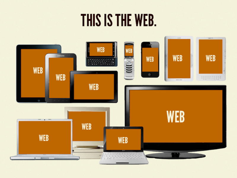
The diversity of today’s web landscape has shattered the consensual hallucination of the desktop web, where we could simply bolt on the mentalities and processes of print to this new medium. Simply looking at a smartphone, tablet, and desktop machine next to one another quickly erodes the assumption that a web design should look the same in every environment.
We’re still at the very beginning of the Big Bang of connected devices. The device and web landscape of tomorrow will undoubtedly be even bigger and diverse than today’s. In addition to current devices and the nascent technologies already on the horizon, the future web will involve technologies and ideas that haven’t yet been conceived.
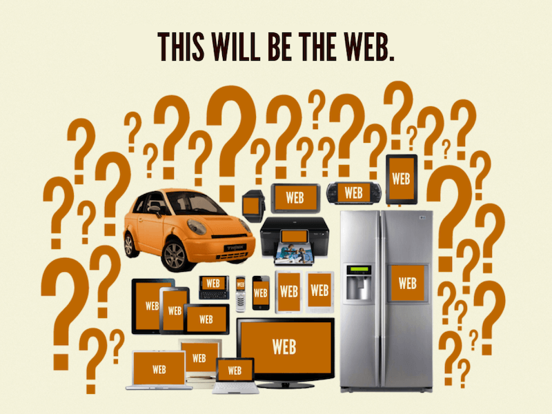
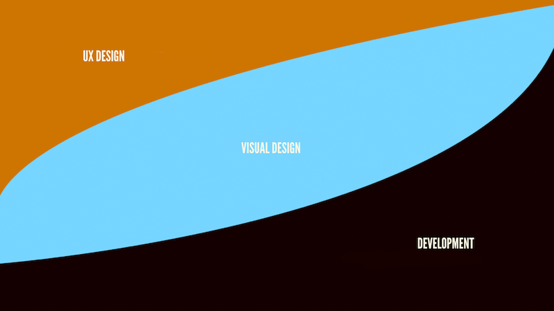
I’ve found the three previous images to be a tremendously helpful shorthand for helping clients, colleagues, and stakeholders understand the reality of the web landscape. With this newfound understanding, everyone becomes a whole lot more receptive to updating their processes and workflows to create great work for this unique medium.
It’s our job to create great experiences for people using a diversity of devices, screen sizes, network speeds, device capabilities, browser features, input types, form factors, contexts, and preferences. That’s undoubtedly a Herculean task, but all these variables really underscore the need to extend far beyond visual aesthetics when creating interface design systems.
In addition to making visually beautiful and consistent experiences, we should:
- Embrace the ubiquity of the web by creating accessible, resilient design systems. Recognize that a whole slew of people with a vast spectrum of capabilities will be accessing our experiences, so construct design systems to be as inclusive as possible.
- Create flexible layouts and components so our interfaces look and function beautifully irrespective of any particular device dimension or screen size.
- Treat performance as an essential design principle and create fast-loading experiences that respect users and their time.
- Progressively enhance our interfaces by establishing core experiences then layering on enhancements to take advantage of the unique capabilities of modern devices and browsers.
- Create future-friendly design systems meant to stand the test of time and anticipate inevitable changes to the device and web landscape.
Of course, there are many other design considerations that should be included in our interface design systems (ergonomics, input type, Section 508 compliance, legibility, and so on), but the key takeaway here is to expand the definition of what constitutes good digital design beyond visual aesthetics.
As you might expect, substantial changes to our processes need to happen so we can properly address all these uniquely digital design considerations. It therefore becomes our responsibility to set client, colleague, and stakeholder expectations so that everyone knows the process for creating will be different this time around.
Death To The Waterfall
Tell me if you’ve heard this one before. A team is tasked with making a website. Once the kick-off meeting dust has settled, a UX designer goes away, puts their head down, and eventually emerges with a giant PDF document detailing the entire experience. This monolithic wireframe document gets passed around to the project stakeholders, who sign it off after some feedback and suggestions.
The UX designer then passes the wireframes to the visual designer, who hops into Photoshop or Sketch to apply color, typography, and texture to the structured-but-sterile wireframes. In the design review meeting, stakeholders sit eagerly while the projector fires up and the project manager runs off to print copies of the design deck for everyone. The art director takes their position at the front of the room and unveils the design. Behold, a website design! Once the presentation is finished, the room quickly buzzes with feedback and conversation. After the initial reactions and compliments die down, a key stakeholder speaks up.
“This looks fantastic, and I think really hits the mark for what we’re trying to accomplish with this project. *But…*”
They express their desire to see something perhaps with an alternate layout, something that captures a certain vibe, maybe something that uses different photography, something that just… pops.
With the floodgates opened, the other stakeholders suddenly realize they too have opinions and constructive criticism they’d like to share. By the time the meeting draws to a close, everyone has rambled off their wish list of what they’d like the design to accomplish.
Slightly deflated but determined to nail it, the visual designer retreats back to their tools to work in the stakeholders’ suggestions. At the next design review meeting, the same scene repeats itself, with stakeholders expressing equal parts encouragement and longing for more. “I feel like we’re almost there. Could we just…”
Weeks pass and seasons change. Nerves wear thin, and the deadline date looms over everyone’s heads. It’s with a sense of urgency that homepage_v9_final_for-review_FINAL_bradEdits_for-handoff.psd finally gets approval by the stakeholders.
The visual designer, relieved they’ve finally completed their job, tiptoes oh-so-quietly up to the entrance of the Code Cave. They slip the approved design under the door, and as they scamper away they yell, “Can you get this done in three weeks? We’re already behind schedule and we’re out of budget!”
The visual designer has already disappeared into the night by the time the front-end developer picks the design off the floor. With one glance at the composition, a strange feeling—some combination of bewilderment, rage, and dread—washes over them. What’s wrong with the design, exactly? Maybe it’s the seven typefaces and nine unique button styles peppered throughout the comps. Maybe it’s the desktop-centric, impossible-to-actually-execute layout. Maybe it’s the perfect-yet-improbable user-generated content.
The front-end developer tries in vain to raise their concerns to the broader group, but is quickly dismissed as being either inept or curmudgeonly. Alas, it’s too late in the game to make significant changes to the design, especially since it’s already been approved by the stakeholders.
So the developer tries their best to make lemonade out of the lemony static comps. They bend over backwards to create responsive layouts that still retain the integrity of the static comps, normalize some of the more blatant component inconsistencies, establish pattern states (like button hover, active, and disabled states) that weren’t articulated in the designs, and make some on-the-fly decisions regarding the interactive aspects of the experience. Discussions with designers are strained, but everyone realizes that they need to work through these issues to get the project done.
After plugging the front-end code into a CMS, frantically finalizing the site’s content, and doing some last-minute QA testing, the team finally launches the site. While no one says it out loud, there’s a tinge of disappointment in the air alongside the joy and relief of getting the project out the door. After all, the live site lacks the glossy polish that the comps promised to the stakeholders, and friction between disciplines has bruised some relationships.
I hope this story reads as a work of fiction to you, but based on my own experiences and conversations with countless others, I’m guessing you’ve experienced this tale of woe at one point or another. It may even hit home like a punch in the gut. Whether you’ve endured this process firsthand or not, it’s important to recognize that the Henry Ford-esque waterfall process increasingly isn’t likely to result in great digital work.
The waterfall process may make sense for print, architecture, manufacturing, and other physical media since mistakes and changes are extraordinarily costly. If a team overlooks an error made early in the process, they’ll pay dearly for it later. However, the digital world isn’t constrained by the same limitations as the physical one. Pixels are cheap. Changes can happen in an instant, hypotheses can be quickly tested out, and designs and code can be iterated on again and again.
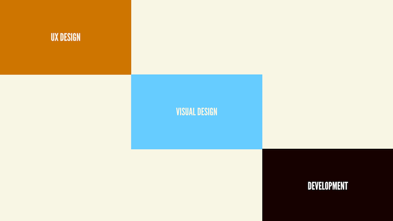
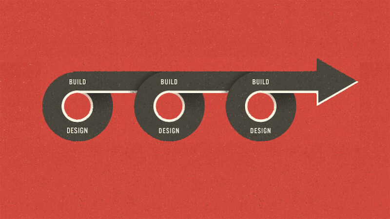
The waterfall process hinges on the premise that work must flow in a sequential order: the UX designer’s work must be completed before visual design can start; the visual designer must finish their job before front-end development can begin. This simply isn’t true. There is much work that can and should happen in parallel. To create sound UI design systems, we must reset our stakeholders’ expectations and get them comfortable with a blurrier, more collaborative process.
That work will happen in parallel doesn’t imply that everyone will be guns blazing throughout the entire process. Of course, the bulk of research, information architecture, and other elemental aspects of UX design will tend to happen earlier in the process, but that work shouldn’t delay the other disciplines from starting their jobs. And even when the bulk of a person’s active work is done, they should never simply fade away from the project. It’s crucial for every discipline to continue to consult with the others to ensure their vision makes it into the final product. So rather than a rigid, sequential waterfall process, a more collaborative process over time looks something like this:
Development Is Design
When a previous employer discovered I wrote HTML, CSS, and presentational JavaScript, they moved me to sit with the engineers and back-end developers. Before too long I was being asked, “Hey, Brad. How long is that middleware going to take to build?” and “Can you normalize this database real quick?”
Here’s the thing: I’ve never had a computer science class in my life, and I spent my high school career hanging out in the art room. Suffice it to say those requests made me extremely uncomfortable.
There’s a fundamental misunderstanding that all coding is ultra-geeky programming, which simply isn’t the case. HTML is not a programming language. CSS is not a programming language. But because HTML and CSS are still code, front-end development is often put in the same bucket as Python, Java, PHP, Ruby, C++, and other programming languages. This misunderstanding tends to give many front-end developers, myself included, a severe identity crisis.
Organizationally, there is often a massive divide between designers and developers (or marketing and IT, or creative and engineering, or some other divisive labels). Designers and developers often sit on different floors, in different buildings altogether, in different cities, and sometimes even in different countries on different continents. While some of this organizational separation may be justified, creating a division between designers and front-end developers is an absolutely terrible idea.
The fact remains that HTML, CSS, and presentational JavaScript build user interfaces—yes, the same user interfaces that those designers are meticulously crafting in tools like Photoshop and Sketch. For teams to build successful user interface design systems together, it’s crucial to treat front-end development as a core part of the design process.
When you show stakeholders only static pictures of websites, they can naturally only comment and sign off on pictures of websites. This sets the wrong expectations. But by getting the design into the browser as fast as possible, you confront stakeholders with the realities of the final medium much sooner in the process. Working in HTML, CSS, and presentational JavaScript allows teams to not only create aesthetically beautiful designs, but demonstrates those uniquely digital design considerations like:
- flexibility
- impact of the network
- interaction
- motion
- ergonomics
- color and text rendering
- pixel density
- scrolling performance
- device and browser quirks
- user preferences
Crucially, jumping into the browser faster also kick-starts the creation of the patterns that will make up the living, breathing design system. More on this in a bit.
This is not to say teams must design entirely in the browser. As with anything, it’s about using the right tools at the right time to articulate the right things. Having the design represented in the browser in addition to other design artifacts gives teams the ability to paint a richer, more realistic picture of the UI they’re crafting. Teams may demonstrate an aesthetically focused design idea as a static image, and simultaneously demonstrate a working prototype of that same idea in the browser.
An Iterative Iterative Iterative Iterative Process
I believe a successful digital design process is quite similar to subtractive stone sculpture. At the beginning of the sculpting process, the artist and their patron have a general idea of what’s being created, but that vision won’t be fully realized until the sculpture is complete.
The sculptor starts with a giant slab of rock and starts chipping away. A crude shape begins to form after the first pass, and the shape becomes more pronounced with every subsequent pass. After a few rounds of whacking away at the rock, it becomes clear that the sculptor’s subject is a human form.
With the general shape of the sculpture roughed out, the artist then begins homing in on specific sections of the piece. For instance, they may begin with the face, moving up close to carve the shape of the eyes, nose, and mouth. After several passes, they then move on to the arms, and then begin detailing the legs. At regular intervals, the artist steps back to see how their detailed work affects the overall sculpture. This process continues until the sculpture is complete and everyone is pleased with the results.

Again, I think subtractive stone sculpture is a great analogy for a successful digital process, although unlike sculpture we have the power of undo!
It’s essential to get stakeholders comfortable with reviewing works in progress rather than fully baked designs and code. As I mentioned in chapter 1, every organization these days wants to become more agile, and iteration is a key part of being agile. It’s more important to make steps in the right direction than exhaust a ton of effort painting unrealistic pictures of what you want the final piece to be. A sound design system doesn’t roll off an assembly line, but is rather sculpted in iterative loops, building up fidelity as the project progresses.
If this all sounds a bit messy, that’s because it is! To the dismay of some project managers, the design process doesn’t fit neatly into the rigid borders of Excel spreadsheets and Gantt charts. True collaboration between disciplines is fuzzy and chaotic, and that’s not a bad thing. Constant communication, tight feedback loops, and true collaboration therefore become the glue that holds the process together. Get your entire team to commit to honest conversation and genuine collaboration, and the details of your process will fall into place.
Are everyone’s expectations properly set? Good! Now let’s roll up our sleeves and get to work establishing our design system.
Establishing Direction
Teams are often eager to jump right into fun high-fidelity design and development work, and clients are eager to see and react to that detailed work. However, this leads to distractions, assumptions, and all the aforementioned misguided expectations. It’s essential to agree on an overall design direction and paint the broad strokes first before moving into high-fidelity design and development. This requires restraint and expectation management, but results in more focused decision-making and more realistic work.
What does this lo-fi work look like? Let’s take a look at some techniques UX designers, visual designers, and front-end developers can use to begin crafting a strong overall direction for a UI design system.
Establishing Content And Display Patterns
There’s a ton of up-front strategic and research work that can and should happen toward the beginning of a project. UX designers (known by other monikers such as information designers, information architects, interaction designers, and so on) are responsible for synthesizing all that vital information and translating it into a user interface that meets the project’s business and user goals.
In a traditional waterfall process, many UX designers have gone about this task by generating high-fidelity wireframes that document every screen of the entire user experience. These wireframe documents, stuffed to the gills with black rectangles and annotations, spec out the details of what the interface will accomplish, and are used to get stakeholder buy-in. As thorough as these documents tend to be, they don’t paint the full picture and often make dangerous assumptions about visual layout and technical functionality.
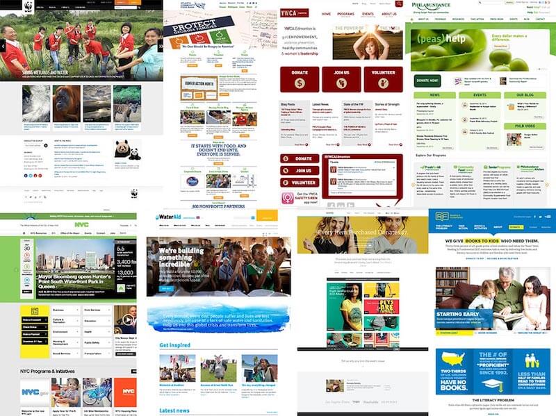
Rather than jumping straight into such high-fidelity documents, it’s better to start with lo-fi sketches that establish what appears on a particular screen and in what general order. Establishing the experience’s basic information architecture can be accomplished with a simple bulleted list and a conversation. For a project I did for the Greater Pittsburgh Community Food Bank, I started by stubbing out the basic information architecture for a page on a site.
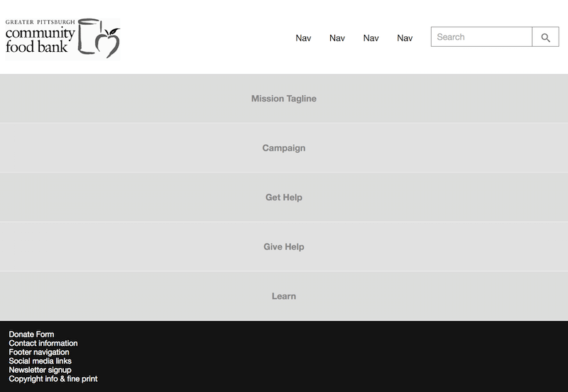
No one in their right mind would mistake this blocked out grayscale page as complete, but it provides more than enough information to have important conversations about the page structure and hierarchy.
Making lo-fi wireframes mobile-first means using the constraints of small screens to force the team to focus on the core content and hierarchy. You can now ask, “Do we have the right things on this screen?” “Are they in the right general order?”
These blocky grayscale wireframes help establish the necessary content patterns for the screen, but UX designers can also articulate some site-wide UI patterns they anticipate using to ultimately display those content patterns. For the redesign of TechCrunch, designer Jennifer Brook defined a few site-wide UI patterns that could be used anywhere:
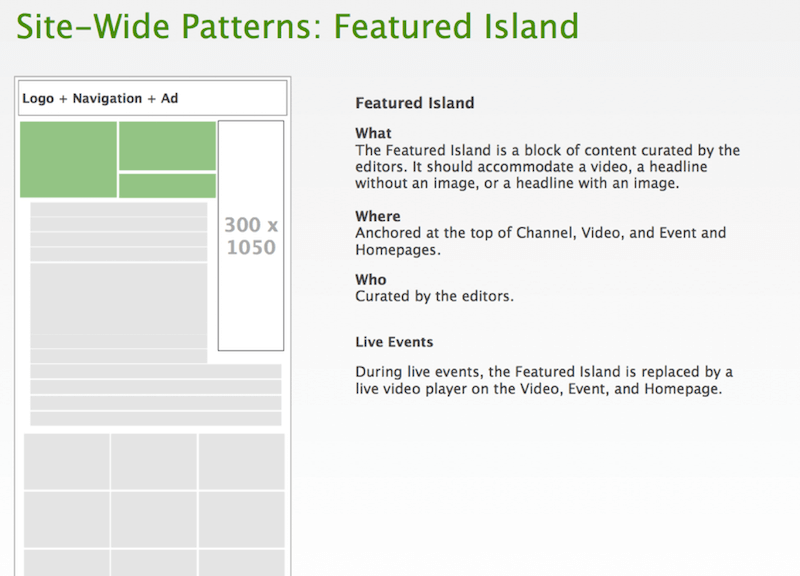
From the image above, you can gather that the “featured island” component will show content in some fashion. Note the gestural nature of this sketch and how it doesn’t make any specific assumptions about layout or functionality. The details of how this pattern will look and function will come later, but at the beginning of the project it’s useful simply to define it and articulate where it might get used.
As I’ve discovered from subsequent projects, content and display patterns can be effectively communicated in an even simpler format: the lowly spreadsheet.
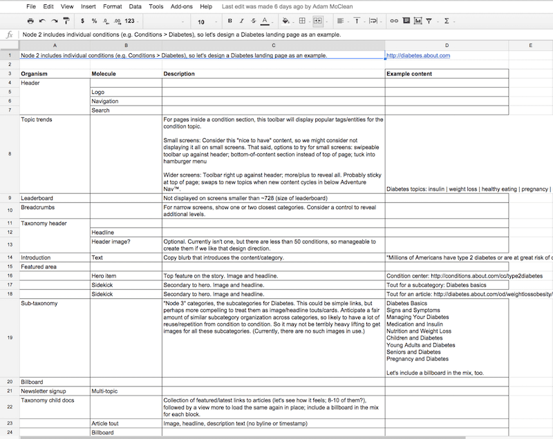
With a few simple spreadsheet columns, we can articulate which display patterns should be included in a given template, and what content patterns they’ll contain. More importantly, we’re able to articulate each pattern’s relative hierarchy and the role it plays on the screen. If you read the leftmost column vertically, you’re effectively looking at the mobile-first view of what the UI could be.
“What content and display patterns go on this page? And in what general order?” are crucial questions to ask, and the techniques we just described can help designers discuss them effectively without making any layout or technical assumptions.
Establishing Visual Direction
A visual designer’s job is to create an aesthetic language and apply it to the user interface in a way that aligns with the project’s goals. To do this, it’s essential for a visual designer to unearth the stakeholders’ aesthetic values.
Historically, visual designers have gone about this by creating full comps—often many comps—to feel out the aesthetic values of the organization. Throw some comps against the wall and see what sticks. As you might imagine, generating a slew of comps from scratch takes an immense amount of time and effort, and unfortunately much of that work finds itself on the cutting room floor. There must be a more efficient way.
As it turns out, there’s a better path to take to arrive at aesthetic values without having to do a hell of a lot of up-front design work. Let’s talk about some of the tactics for making this happen.
The 20-Second Gut Test
A fantastic exercise for quickly establishing aesthetic values is the 20-second gut test. Typically done as part of the project kick-off meeting, the exercise involves showing the stakeholders a handful of pertinent websites (about twenty to thirty of them) for twenty seconds each. The sites you choose should be a healthy blend of industry-specific sites and other visually interesting sites from other industries. For added believability, you can photoshop in your client’s logo in place of the site’s actual logo.
For each site presented, each person votes on a scale from 1 to 10, where a score of 1 means “If this were our site I would quit my job and cry myself to sleep,” while a score of 10 means “If this were our site I would be absolutely ecstatic!” Instruct participants to consider visual properties they find interesting, such as typography, color, density, layout, illustration style, and general vibe.
When the exercise is complete, quickly tally up the scores and come back to the group to discuss the results. Have a conversation about the sites that received the five lowest scores, the five highest scores, and the most contentious scores (sites which some people ranked very high and others ranked very low). The participants should explain why they were attracted or repulsed by a particular site, and work through differences in opinions with the group.
This exercise exposes stakeholders to a variety of aesthetic directions early in the process, allows them to work through differences in taste, and (with any luck) helps arrive at some shared aesthetic values. The visual designer can then latch on to these insights and begin to translate those aesthetic values into a visual direction for the project.
Style Tiles
Once again, visual designers’ first instinct is often to jump right into creating full comps to articulate an aesthetic direction for the project. This high-fidelity work is certainly tangible, but also wastes a ton of time and effort if the comps don’t resonate with the stakeholders. Also, creating high-fidelity comps often makes big assumptions about technical feasibility, which leads to unrealistic expectations and antagonistic relationships with front-end developers.
It’s essential to establish a solid visual direction for the project, so how does a visual designer do that without burning a ton of time on up-front high-fidelity comps? That’s the question that designer Samantha Warren answered when she created style tiles, a deliverable that’s more tangible than a mood board but not as high-fidelity as a fully baked comp.
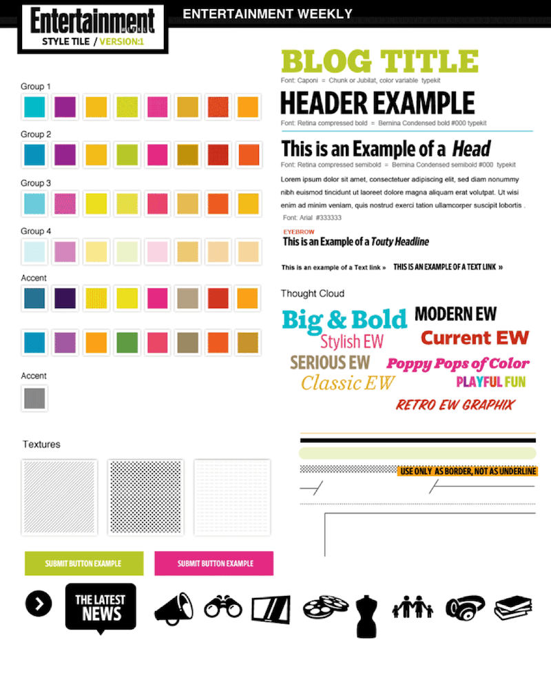
Style tiles (along with their in-browser counterparts, style prototypes) allow designers to explore color, typography, texture, icons, and other aspects of design atmosphere without making assumptions about layout or worrying about polish. They can be designed much faster because they’re not encumbered by the expectations of high-fidelity comps, which means feedback and discussion can happen sooner.
Style tiles facilitate conversation to uncover what stakeholders value and what they don’t. “Does this style tile resonate better with you rather than this one? Why?” “Why does this color palette not sit well with you?” “What is it about this typeface you like?” You can have important conversations about aesthetic design without having to create full comps.
Crucially, style tiles also reinforce pattern-based thinking by educating stakeholders about design systems rather than pages. Presenting color swatches, type examples, and textures exposes stakeholders to the ingredients that will underpin any implementation of the design system.
Element Collages
While style tiles are great for exploring design atmosphere, they’re still a bit abstract. To get a sense of how those design ingredients will be applied to an interface, it’s important to quickly move into something a bit more tangible than a style tile. But does that mean visual designers need to jump from style tiles straight into full comps? Not necessarily.
Somewhere in between style tiles and full comps live element collages, which are collections of UI component design explorations. Element collages provide a playground for designers to apply design atmosphere to actual interface elements, yet still be free from layout and highly polished presentation.
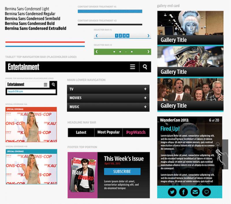
Like style tiles, element collages are meant to facilitate discussion about the aesthetic direction of the project. It’s very clear these collages aren’t an actual website, but stakeholders can still get a sense of what the site could look like. Conversation about these element collages can give visual designers more ideas and direction about where to take the design next, and because of their lo-fi nature, designers can quickly iterate and evolve ideas.
No doubt other tactics exist to establish aesthetic direction for your projects, and which techniques you decide to employ will vary from project to project. But the key is to paint some broader strokes before spending a lot of time and effort on highly detailed design work. Engaging in conversation with stakeholders at this exploratory stage creates a more inclusive process, which is far preferable to a process in which stakeholders simply grunt approval or disapproval of design deliverables.
Front-End Prep Chef
As we discussed earlier, front-end developers are often relegated to crude production machines that are brought into the project only after all the design decisions are made. This archaic process keeps disciplines out of sync with one another and prevents teams from working together in a meaningful way. This is a huge mistake. Including front-end development as a critical part of the design process requires changes to both project structure and team members’ mentalities.
In the restaurant business, an important yet unsung role is that of the prep chef. A prep chef chops vegetables, marinades meat, and makes salads in preparation for the following day’s work. By having ingredients prepared ahead of time, the kitchen staff can focus on collaboration and cooking rather than menial tasks. Without the up-front work of the prep chef, the flow of the main chefs would be interrupted and the fast pace of the kitchen would grind to a halt.

Front-end developers need to be the prep chefs of the web design process. If developers aren’t coding from day one of the project, there’s something wrong with the process. “But Brad,” I can hear you saying, “how can I start coding if I don’t know what I’m supposed to code?”
Believe me, there is plenty of front-end work to do without knowing a thing about the project’s information design or aesthetic direction. In addition to setting up the development environment (such as preparing Git repositories, dev servers, CMSes, and development tools), developers can dive into code and begin marking up patterns. But what should you be marking up if you don’t know anything about the design? That depends on the type of project you’re working on.
Are you making an e-commerce site? You can set up site search, a shopping cart table, a placeholder product detail page, the homepage, and checkout pages. Making an online service? Start marking up the sign-up and login forms, the forgot password flow, and dashboard. And, of course, most websites will have a header, footer, and main content area. Set up shell templates and write basic markup for patterns you anticipate using. This markup will initially be crude, but it provides a crucial starting point for collaboration and iteration.
This front-end prep chef work frees up developers’ time to collaborate with designers, rather than working after design is complete. With basic markup in place, developers can work with designers to help validate UX design decisions through conversations and working prototypes. They can help visual designers better understand source order and web layout, and can quickly produce a fledgling codebase that will eventually evolve into the final product.
Stop, Collaborate, And Listen
Let’s quickly review what establishing design direction looks like across disciplines:
- UX designers can create lo-fi sketches to establish basic information architecture and some anticipated UI patterns.
- Visual designers can gather the teams’ aesthetic values by conducting a 20-second gut test exercise, then create style tiles and element collages to explore initial design directions.
- Front-end developers can set up project dependencies, stub out basic templates, and write structural markup for patterns the team anticipates using in the project.
This work can happen concurrently but shouldn’t happen in isolation. Sure, there will need to be some initial head-down time for each discipline to get set up, but all team members should be fully aware of each discipline’s explorations in anticipation of working together to evolve these ideas.
"Ideas are meant to be ugly." — Jason Santa Maria
At this early stage, it’s important to stress the importance of exploration, play, and idea generation. The lo-fi nature of the techniques we just discussed help encourage this exploration, allowing team members to pursue ideas that excite them. Sometimes those ideas might be best articulated as a napkin sketch, a prototype in CodePen, a visual exploration in Sketch, a quick wire in Balsamiq, a motion concept in After Effects, or some combination of media and tools. The point is for the team to generate ideas and solve problems, not to enforce a rigid order of operations. By approaching this design exploration in a cross-disciplinary way, teams can find balance between aesthetics, technical feasibility, usability, and functionality.
Rolling Up Our Sleeves
With a general design direction established, the team can roll up their sleeves to build the interface and its underlying design system. But how do teams turn a vague sense of direction into a beautiful, functional, usable, and complete design system?
From Concept To Complete
Turning explorations into finished patterns is a blurry, imperfect process. This should come as absolutely no surprise to you by this point in the book.
For the TechCrunch project, Dan Mall riffed on the team’s initial design conversations to create a visual exploration for the site’s header. This piece of interface was a logical place to start since the header is one of the most prominent and branded elements on the page. After a little bit of work, we hopped on a call to discuss the exploration with the client.
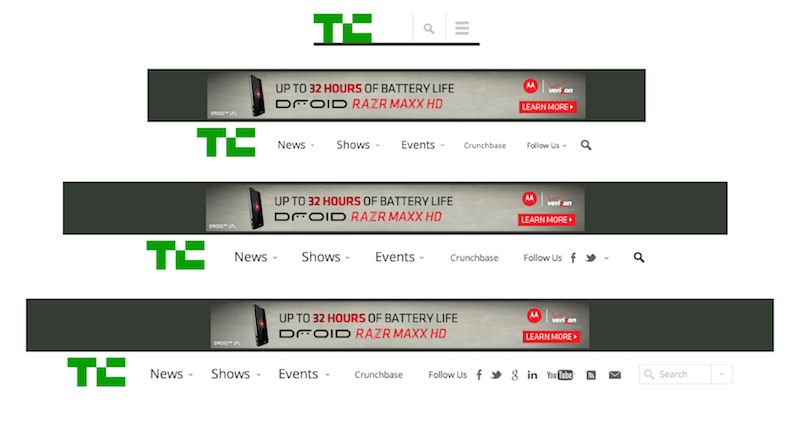
Even though this design artifact was a simple in-progress exploration, we were able to have important conversations about the header’s aesthetics, hierarchy, and suggested functionality. Because the header was presented sans context, we were able to discuss the issues pertaining to the header without stakeholders’ focus wandering to other page elements.
Though the client didn’t know it, I had been building out a working HTML version of the header behind the scenes in Pattern Lab.

This grayscale prototype allowed us to demonstrate interactivity and responsiveness, which led to even more discussion. Collectively we proposed changes to the header’s layout and functionality, and I was able to make changes using the browser’s development tools during the call. Suddenly, the entire team and stakeholders were actively participating in the design process!
With input from the stakeholders and team, we iterated over the header pattern to massage the layout, IA, aesthetic details, and functionality to arrive at the solution we ultimately launched with.
Obviously the header pattern doesn’t exist in a vacuum. Within Pattern Lab, the header was included in every template using Mustache’s include pattern that we discussed in chapter 3.
`{{> organisms-header }}
`
This allowed us to view the header within the context of the rest of the pages, sketchy as they initially were. So while we were focusing on designing one specific pattern, we were simultaneously taking into account the context of where that pattern would be employed.
Initially, in-browser designs tend to look crude at best, which is A-OK. The intention is to stub out the template’s basic information architecture in the browser, define patterns, wire up those patterns using includes, and begin the patterns’ general markup. With that work in place, the team can collectively begin styling specific patterns and refining the overall structure.
Seeing these partially designed prototypes might look unusual to those used to more traditional, pixel-perfect design deliverables. But it’s far more important to communicate progress than a false sense of perfection, which is why rolling updates are preferable to big reveals.
The Role Of Comps In A Post-PSD Era
Up until this point we’ve been talking about establishing a general aesthetic direction and then designing some patterns to experiment with the application of that aesthetic direction. These relatively lo-fi tactics allow teams to explore freely, iterate quickly, and get feedback sooner.
But I’ll never forget this client feedback we received on the first pattern-driven project I worked on: “These element collages look great, but it’s like you’re asking me to comment on how beautiful a face is by showing me the nose.”
If you’ve gotten to this point in your process, congratulations! Feedback like this means they’re salivating for more, so now that you’ve captured a general aesthetic direction you can safely put those explorations into context. That likely involves creating full static comps.
Listen to the chatter around “designing in the browser” and you’ll undoubtedly hear that Photoshop comps are the devil incarnate. Which, of course, isn’t true. Throughout this book we’ve discussed the importance of breaking things down into their atomic elements while simultaneously building up a cohesive whole. Static comps are effective at painting a full picture of what the UI could look like. The trick is knowing when to paint those full pictures, and knowing how long to dwell in static design documents
For the TechCrunch project, we created a comp for the article template only after the client was feeling good about our element collage explorations. Creating full comps requires a lot of effort, which is why we established the design direction first to mitigate the risk of all that full-comp effort going straight into the trash if we got it totally wrong.
Comps, like any other design artifact, are used to facilitate a conversation with the project stakeholders. If their feedback is, “This feels all wrong,” then it’s back to the drawing board to create a new comp. But if their feedback suggests, “Can we move this from here to here? Can we add a gray border around the article text? Can we increase the size of this image?” that’s a sign the overall direction is in good shape and those relatively minor issues can be addressed in the browser.
In-Browser Iteration
Static comps can be great for shaping the overall aesthetic direction of a template, but users will ultimately view and interact with the experience in a browser. That’s why designs should be quickly translated into the final environment and iterated on there.
Working in the browser allows teams to address layout issues across the entire resolution spectrum, design around dynamic data (such as variable character lengths, image sizes, and other dynamic content), demonstrate interaction and animation, gauge performance, factor in ergonomics, and confront technical considerations (such as pixel density, text rendering, scrolling performance, and browser quirks). Static design comps cannot deal with all these considerations, so they should be treated merely as hypotheses rather than set-in-stone specifications. Only when transferred to the browser can any design hypothesis truly be confirmed or rejected.
"Let’s change the phrase “designing in the browser” to “deciding in the browser.”" — Dan Mall
Once the designs are in the browser, they should stay in the browser. At this stage in the process, the point of production shifts to team members adept at crafting HTML, CSS, and presentational JavaScript. Patterns should be created, styled, and plugged in wherever they’re needed. Designers can react to these in-browser implementations and can create spot comps in static tools to help iron out responsive wrinkles at the organism level. This back-and-forth between static and in-browser tools establishes a healthy loop between design and development, where the front-end code becomes more solid and stable with each iterative loop.
The beautiful thing about a pattern-based workflow is that as each pattern becomes more fully baked, any template that includes the pattern will become more fully baked as well. That means the level of effort to create new templates decreases dramatically over the course of the project, until eventually creating a new template mostly involves stitching together existing patterns.
Bring It On Home
The design system is taking shape and the team is cooking with gas to bring the project home. At this stage, UI patterns are well established, the team is taking some final steps to tighten everything up and prepare for launch.
UX designers are hitting the prototype hard to make sure the flows and interactions are all logical and intuitive. Visual designers are combing over the interface and proposing design tweaks to the UI to polish up the design. Front-end developers are testing the experience in a slew of browsers and devices while also addressing design feedback. Back-end developers are hard at work integrating the front-end UI into the CMS (we’ll talk more about the relationship between front-end and back-end in chapter 5). And, of course, the clients and stakeholders are making last-minute demands—I mean suggestions—about the design and content. The whole team is contributing documentation for the style guide, cleaning up the patterns in the pattern library, and working hard to get the website off the ground.
Then—seemingly in the blink of an eye—the website and accompanying design system launch. Champagne is poured, high-fives are exchanged and, of course, post-launch bugs are squashed. Users visit the new site to find a beautiful, functional, consistent, and cohesive experience that undoubtedly makes them weep tears of joy. Mission accomplished.
What began as a giant slab of rock is now a finely polished sculpture, thanks to a ton of hard work, genuine collaboration, constant communication, and plenty of iteration. Moreover, in addition to a brand-spanking-new website, the team leaves behind a flexible, deliberate UI system bundled up in a beautiful style guide.
This chapter explored everything that goes into making an effective UI design system. If you like what you were reading, we’ve got you covered! The print version of Smashing Book 5 (including the eBook) bundled with the Atomic Design eBook is available today for just $29 — down from $49. Get the bundle now.
Further Reading
- Pattern Library First: An Approach For Managing CSS
- The “Other” Interface: Atomic Design With Sass
- Designing Web Design Documentation
- Making Your Collaboration Problems Go Away By Sharing Components
 (ms, il, vf, mrn)

