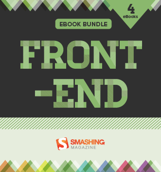
Front-End eBook Bundle (4 eBooks)
ePUB, Kindle, PDF
Download PDF, ePUB, Kindle.
Thanks for being smashing! ❤️
About The ebook Bundle
Tailored to the needs of front-end developers, this eBook bundle contains four selected Smashing eBooks on HTML, CSS, responsive web design, and more. A valuable companion to master your daily front-end challenges.
This eBook bundle contains all of the following eBooks, each of which are downloadable in all formats: ePub, Kindle, and PDF:
- The New Hardboiled Web Design
If you’re hungry to learn about how the latest techniques will make your websites more creative, flexible and adaptable, then “Harboiled Web Design” is for you.
- What The Hell Is Hardboiled? — You’ll discover what it means to be hardboiled for you, your designs and your workflow. Think again about what we can do instead of what we couldn’t. Embrace the possible, instead of complaining about limitations.
- (Give Me That) Ol’ Time Religion — You’ll discover why it’s important to constantly re-evaluate concepts such as progressive enhancement and graceful degradation. Learn about the basics of how a page should work in first place, not necessarily how a design should look. Get away from limiting your creativity to the capabilities of a lowest common denominator browser.
- The Way Standards Develop — You’ll find out the cold, hard truth about how standards are really developed. Learn about ten CSS modules that are most relevant to the work we do, its vendor-specific prefixes, and how to manage them with your favorite tools effectively.
- It Doesn’t Have To Look The Same — You’ll learn that responsive web design is an opportunity to make fabulous creative work, an opportunity that you should grab with both mitts. Embrace that not all browsers should render websites in the same way and focus on providing the most appropriate experience for the capabilities of a browser or device. All that without anyone being left unable to access content or features.
- Atoms And Elements — You’ll learn about designing atoms and elements and how web design style guides help you presenting designs in a more effective way. Learn how to present the atmosphere of a design while designing components separate from layout with Style Guides.
- Designing Atmosphere — You’ll find out how to design a great atmosphere by starting with typographic elements, how to select the right typeface, weight, line-height, and more. Learn how to use type proofs for presentation, how to balance them the right way and how to make them legible and readable on many different screens. Last but not least, you’ll dig into color accessibility and add decorative aspects that help give a design its personality.
- Destination HTML5 — You’ll learn how to use HTML’s semantic elements alongside the BEM naming system. You’ll repeat the widely supported contemporary HTML5 standards such as section, article, aside, header, footer, and nav. You’ll learn how to make your markup faster, more responsive and, of course, hardboiled.
- Hardboiled Microformats2 — Because your SEO ranking matters, you’ll discover the updated microformats2 — simple markup patterns for making your data machine-readable and therefore search engine friendly.
- WAI-ARIA Roles — While microformats2 are dedicated to make you website machine-readable, WAI-ARIA roles have different but complementary goals. You’ll learn how to make your web content easier to use by people who use assistive technologies such as navigation menus, sliders, progress meters, properties that define dynamically updated sections of a page, ways to enable keyboard navigation and roles to describe the structure of a page, including headings, regions, and tables (grids).
- Hardboiled Foundations — In this chapter, you’ll dive deep into CSS Media Queries. By organizing it into six groups of elements that consider site-wide page styles, typography, form elements, tables, and images, you’ll learn how to style small screens first and how to choose breakpoints that are based on content rather than devices.
- Flexible Box Layout — You’ll investigate new Flexible Box layouts and how to visually reorder content without laying a hand on your markup, how to overcome common frustrations such as equal height backgrounds on unequal height columns, and more.
- Responsive Typography — Much of the web content we consume every day consists of the written word. Learn about the different web font formats and how to implement them properly, with fallback fonts and website performance in mind. You’ll learn how to specify the web fonts to low-resolution and high-resolution display, and how to test them on different resolution screens.
- RGBa And Opacity — With your hardboiled HTML all set and your smaller screen styling in place, you’ll now give your design an extra level of fidelity and interaction that makes the most of the space available on larger screens. You’ll redevelop our vertical list into a grid of eight magazine covers that reveal their descriptions when we press on them. You’ll do this by applying relative positioning but without any horizontal or vertical offsets.
- Borders — CSS borders can be exciting because they include properties that open up a wealth of creative opportunities. You’ll investigate new design possibilites with properties such as border-radius (that our clients love so much) and border-image for using images inside those borders.
- Background Images — Since we’re also able use multiple background images and to change their origin point and size, there’s a vast variety new creative opportunities. You’ll get started by making a design using multiple background images. Background properties give us precise control over the size of our background images and how they’re rendered behind our elements.
- Gradients — Flat design aesthetic has become the norm. Almost every site you see these days include large, flat areas of colour, often laid out across horizontal bands, almost always the full width of our screens, with flat or outlined buttons, and icon graphics that are also flat. You’ll learn how to move on from the mediocrity this flat aesthetic epitomises and you’ll see web design that’s rich and full of life. Whether you like linear gradients, radial, repeating or with multiple background images — you’ll need to know how to handle them.
- Background Blends And Filters — The rapidly increasing pace of change is a good thing for designers and developers, businesses and brands, and the internet in general. New technologies like CSS filters and background blends are not only being introduced faster, but they’re being implemented in browsers and turned into standards faster, too. Now’s not a time to kick back — it’s a time to use these exciting new tools to make creative work with depth and subtlety, work that’s hardboiled.
- Transforms — CSS layouts can sometimes be a little strait-laced. You’ll learn how two-dimensional and three-dimensional transforms can help your designs break out of the box.
- Transitions — In web pages and applications, changes in state can have a huge impact on how it feels to use an interface. Make a change too fast and an interaction can feel unnatural. Make it too slow, even by a few milliseconds, and an interface will feel sluggish. You’ll learn how to make state changes smoother with a host of CSS transitions.
- Multi-column Layout — You might be surprised how unimaginative most website layouts are today, particularly since the responsive web design came up. But there’s so much to learn from print design that should inspire your work on the web. The different ways that magazine designers use columns of text to make their publications individual are an enormous inspiration. In this chapter, we’ll learn how to use CSS multicolumn layout and how to use it for today’s responsive designs.
- Behind The Scenes Of Real-Life Projects
The eBook “Behind the Scenes of Real-Life Projects” takes a closer look at the techniques and stories of some folks behind real-life Web projects.
- Building The New Financial Times Web App
- Bringing Angry Birds To Facebook
- Behind The Scenes Of Nike Better World
- Behind The Scenes Of Tourism New Zealand
- Tale Of A Top-10 App, Part 1: Idea And Design
- Tale Of A Top-10 App, Part 2: Marketing And Launch
- Gone In 60 Frames Per Second: A Pinterest Paint Performance Case Study
- Inside Google’s User Experience Lab: An Interview With Google’s Marcin Wichary
- Mistakes I’ve Made (And Lessons Learned Along The Way)
- HTML Semantics
You won’t get far without the foundational understanding of HTML semantics. This eBook addresses the importance of semantics in our code.
- HTML5 Semantics
- When One Word Is More Meaningful Than A Thousand
- HTML5 And The Document Outlining Algorithm
- Our Pointless Pursuit Of Semantic Value
- Pursuing Semantic Value
- The Semantic Grid System: Page Layout For Tomorrow
- Performance Optimization: Techniques And Strategies
Tracking down performance bottlenecks does not only improve loading times but also results in a much snappier experience and a higher user engagement.
- Improving Smashing Magazine’s Performance: A Case Study
- How To Speed Up Your WordPress Website
- You May Be Losing Users If Responsive Web Design Is Your Only Mobile Strategy
- How To Make Your Websites Faster On Mobile Devices
- Creating High-Performance Mobile Websites
- Don’t Get Crushed By The Load: Optimization Techniques And Strategies
- Speed Up Your Mobile Website With Varnish
- Cache Invalidation Strategies With Varnish Cache
- Gone In 60 Frames Per Second: A Pinterest Paint Performance Case Study
ePUB, Kindle, PDF
$ 29.00More Books

Accessible UX Research

Success At Scale
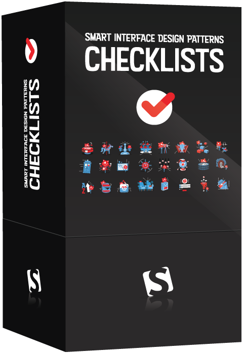
Interface Design Checklists
166 practical cards for common interface design challenges.
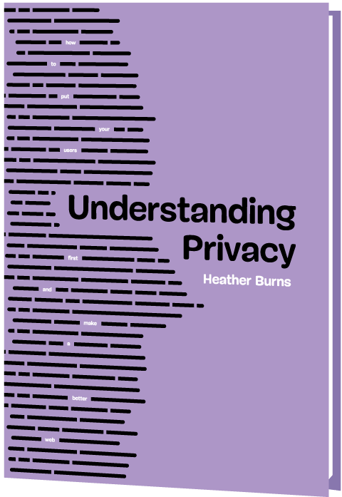
Understanding Privacy
How to put your users first and make a better web.
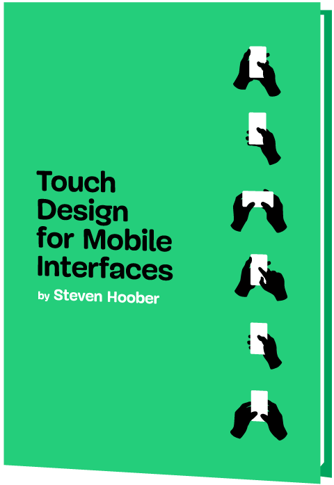
Touch Design for Mobile Interfaces
Want to learn how to improve the design of your mobile digital products? Learn how touchscreen devices really work — and how people really use them.
Image Optimization
Deliver high-quality responsive images in the best format and size, and at the moment your users need them.
TypeScript in 50 Lessons
Everything you need to know about TypeScript, its type system, and all its benefits in 50 lessons.
Click!
A guide to increasing conversion and driving sales sustainably.
The Ethical Design Handbook
A practical guide on ethical design for digital products.
Inclusive Components
Handbook for building robust, accessible interfaces.
Smashing Print
A printed magazine designed to make you think.
Art Direction for the Web
Creating engaging, art-directed experiences on the web.
Smashing Book 6
Exploring new frontiers in front-end and design.
Design Systems
Create effective design systems that empower teams to create great digital products.
Form Design Patterns
Designing and coding inclusive and usable web forms.
User Experience Revolution
Help organizations understand and embrace digital.
White Hat UX
How to avoid dark patterns and improve user experience.
Digital Adaptation
Helping traditional companies embrace and make use of digital.
Inclusive Design Patterns
Creating bulletproof, accessible HTML/CSS components.
Smashing Book #5
Smart responsive design techniques from real projects.
The Sketch Handbook
Everything you need to know to understand and use Sketch.