Responsive Web Design Guidelines and Tutorials
In this overview you will find the most useful and popular articles we have published on Smashing Magazine on Responsive Web Design.
Quick Overview
- Design Process In The Responsive Age
- Responsive Web Design: What It Is and How To Use It
- A Foot On The Bottom Rung: First Forays Into Responsive Web Development
- Techniques For Gracefully Degrading Media Queries
Responsive Web Design Techniques, Tools and Design Strategies
How To Use CSS3 Media Queries To Create a Mobile Version of Your Website
Design Process In The Responsive Age
You cannot plan for and design a responsive, content-focused, mobile-first 1 website the same way you’ve been creating websites for years—you just can’t. If your goal is to produce something that is not fixed-width and serves smaller devices just the styles they require, why would you use a dated process that contradicts those goals?

I’d like to walk you through some problems caused by using old processes with responsive design. Let’s look into an evolving design process we’ve 2 been using with some promising new deliverables and tools. This should provide a starting point for you to freshen up your own process and bring it into the responsive age.
Responsive Web Design: What It Is and How To Use It
Almost every new client these days wants a mobile version of their website. It’s practically essential after all: one design for the BlackBerry, another for the iPhone, the iPad, netbook, Kindle — and all screen resolutions must be compatible, too. In the next five years, we’ll likely need to design for a number of additional inventions. When will the madness stop? It won’t, of course.

In the field of Web design and development, we’re quickly getting to the point of being unable to keep up with the endless new resolutions and devices. For many websites, creating a website version for each resolution and new device would be impossible, or at least impractical. Should we just suffer the consequences of losing visitors from one device, for the benefit of gaining visitors from another? Or is there another option?
A Foot On The Bottom Rung: First Forays Into Responsive Web Development
Responsive design is the hottest topic in front-end Web development right now. It’s going to transform the Web into an all-singing, all-dancing, all-devices party, where we can access any information located anywhere in the world. But does responsive design translate well from the text-heavy Web design blogosphere to the cold hard reality of commercial systems?

Rumors came through our office grapevine that management was looking to revamp our mobile presence. There was talk of multiple apps being built externally that could be used on some of the major mobile devices. Our team had been getting familiar with responsive design and put forward a proposal of doing away with device-specific apps and developing a single responsive website that could be served to both desktop and mobile users. After a few hasty demos and prototypes, the idea was accepted and we began work.
Techniques For Gracefully Degrading Media Queries
Media queries are the third pillar in Ethan Marcotte’s implementation of responsive design. Without media queries, fluid layouts would struggle to adapt to the array of screen sizes on the hundreds of devices out there. Fluid layouts can appear cramped and unreadable on small mobile devices and too large and chunky on big widescreen displays. Media queries enable us to adapt typography to the size and resolution of the user’s device, making it a powerful tool for crafting the perfect reading experience.

CSS3 media queries, which include the browser width variable, are supported by most modern Web browsers. Mobile and desktop browsers that lack support will present a subpar experience to the user unless we step up and take action. I’ll outline some of techniques that developers can follow to address this problem.
Responsive Web Design Techniques, Tools and Design Strategies
Back in January, we published an article on responsive design, “Responsive Web Design: What It Is and How to Use It.” Responsive design continues to get a lot of attention, but considering how different it is from the “traditional” way of designing websites, it can be a bit overwhelming for those designers who have yet to try it.

To that end, we’ve compiled this roundup of resources for creating responsive website designs. Included are tutorials, techniques, articles, tools and more, all geared toward giving you the specific knowledge you need to create your own responsive designs.
How To Use CSS3 Media Queries To Create a Mobile Version of Your Website
CSS3 continues to both excite and frustrate web designers and developers. We are excited about the possibilities that CSS3 brings, and the problems it will solve, but also frustrated by the lack of support in Internet Explorer 8. This article will demonstrate a technique that uses part of CSS3 that is also unsupported by Internet Explorer 8. However, it doesn’t matter as one of the most useful places for this module is somewhere that does have a lot of support - small devices such as the iPhone, and Android devices.

In this article I’ll explain how, with a few CSS rules, you can create an iPhone version of your site using CSS3, that will work now. We’ll have a look at a very simple example and I’ll also discuss the process of adding a small screen device stylesheet to my own site to show how easily we can add stylesheets for mobile devices to existing websites.
Device-Agnostic Approach To Responsive Web Design
This is a different take on Responsive Web design. This article discusses how we can better embrace what the Web is about by ignoring the big elephant in the room; that is, how we can rely on media queries and breakpoints without any concern for devices.
Progressive And Responsive Navigation
Developing for the Web can be a difficult yet rewarding job. Given the number of browsers across the number of platforms, it can sometimes be a bit overwhelming. But if we start coding with a little forethought and apply the principles of progressive enhancement from the beginning and apply some responsive practices at the end, we can easily accommodate for less-capable browsers and reward those with modern browsers in both desktop and mobile environments.

Content Prototyping In Responsive Web Design
While the reality of client work sometimes makes it challenging to gather and produce content prior to starting the design, this is now widely accepted as being necessary. You may have heard this referred to as “content-driven design.” I’m not the first to suggest 2 that our current approach to responsive Web design could be improved by imparting a bigger role to content in determining how our websites respond. However, I haven’t seen many (if not any) practical explanations on how to do this. I’d like to start this conversation by introducing a theoretical concept called a “content prototype.”

Is There Ever A Justification For Responsive Text?
Depending on who you follow and what you read, you may have noticed the concept of “responsive text” being discussed in design circles recently. It’s not what you might imagine — resizing and altering the typography to make it easier to read on a range of devices — but rather delivering varying amounts of content to devices based on screen size.
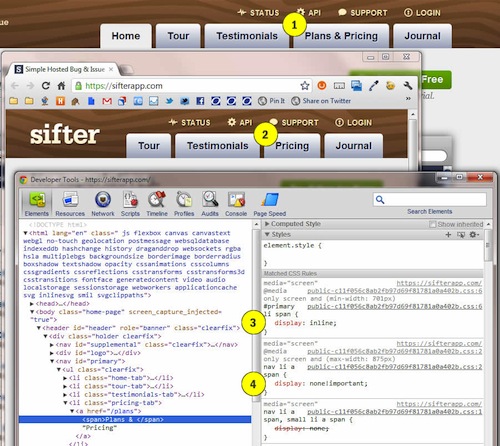
One example of this is an experiment by designer Frankie Roberto. Another is the navigation menu on the website for Sifter App. Roberto and Sifter are using media queries to actually hide and display text based on screen size (i.e. not rewriting or delivering different content based on context — as one would do with mobile-focused copy, for example).

Having looked at how this technique works, I wouldn’t endorse it yet, because its practical value is not clear. Also, describing this as “responsive” could legitimize what is possibly a less than optimal coding technique. Below are screenshots of how it works on the Sifter website:


 See the full picture →
 Celebrating 10 million developers


 SurveyJS: White-Label Survey Solution for Your JS App

