Understanding CSS Grid: Grid Template Areas

Email Newsletter
Weekly tips on front-end & UX.
Trusted by 182,000+ folks.
 Custom Web Forms for Angular, React, & Vue. Your backend.

 Celebrating 10 million developers

When using CSS Grid Layout, you can always place items from one grid line to another. However, there is an alternate way of describing your layout, one that is visual in nature. In this article, we will learn how to use the grid-template-areas property to define placement on the grid and find out how the property really works.
In case you missed the previous articles in this series, you can find them over here:
- Part 1: Creating A Grid Container
- Part 2: Grid Lines
- Part 3: Grid Template Areas
Describing Layout With grid-template-areas
The grid-template-areas property accepts one or more strings as a value. Each string (enclosed in quotes) represents a row of your grid. You can use the property on a grid that you have defined using grid-template-rows and grid-template-columns, or you can create your layout in which case all rows will be auto-sized.
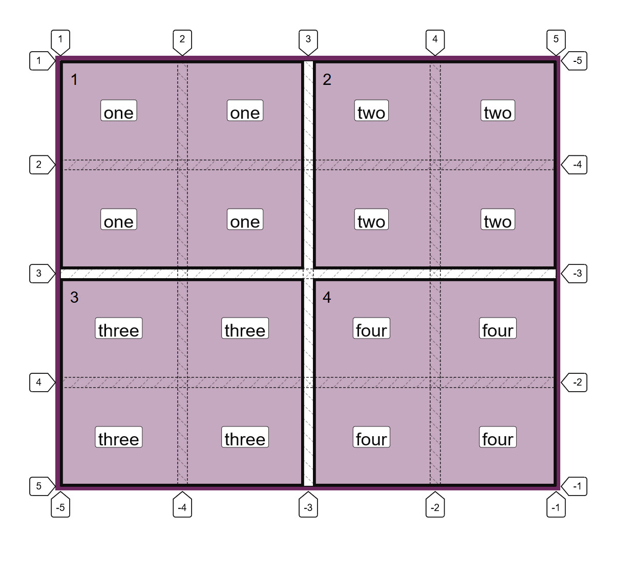
The following property and value describe a grid with four areas — each spanning two column tracks and two row tracks. An area is caused to span multiple tracks by repeating the name in all of the cells that you would like it to cover:
grid-template-areas: "one one two two"
                     "one one two two"
                     "three three four four"
                     "three three four four";
Items are placed into the layout by being named with an ident using the grid-area property. Therefore, if I want to place an element with a class of test into the area of the grid named one, I use the following CSS:
.test {
  grid-area: one;
}
You can see this in action in the CodePen example shown below. I have four items (with classes one to four); these are assigned to the relevant grid area using the grid-area property and therefore display on the grid in the correct boxes.
See the Pen Simple grid-template-areas example by Rachel Andrew (@rachelandrew) on CodePen.
If you use the Firefox Grid Inspector, then you can see the area names and the grid lines demonstrating that each item does indeed span two row and two column tracks — all without doing any line-based positioning on the item itself.
Rules For Using grid-template-areas
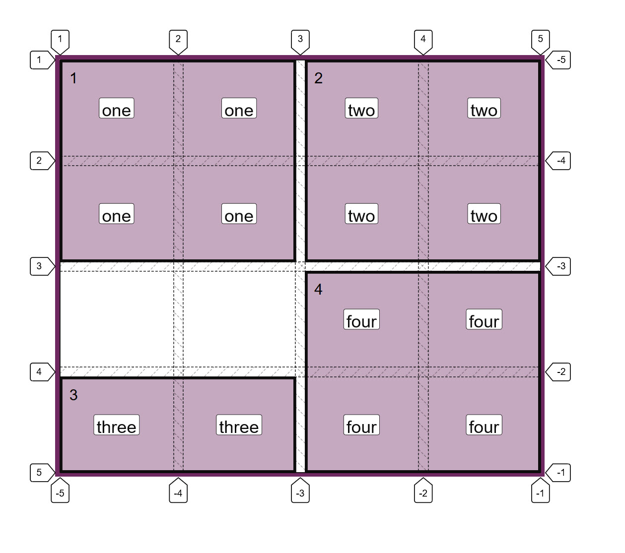
There are a few rules when creating a layout in this way. Breaking the rules will make the value invalid and therefore your layout will not happen. The first rule is that you must describe a complete grid, i.e. every cell on your grid must be filled.
If you do want to leave a cell (or cells) as empty space, you do this by inserting a . or series such as ... with no space between them.
Therefore, if I change the value of grid-template-areas as follows:
grid-template-areas: "one one two two"
                     "one one two two"
                     ". . four four"
                     "three three four four";
I now have two cells with no content in them. Item three only displays in the last row of the grid.
You can only define each area once, meaning that you can’t use this property to copy content into two places on the grid! So the following value would be invalid and cause the entire property to be ignored as we have duplicated the area three:
grid-template-areas: "one one three three"
                     "one one two two"
                     "three three four four"
                     "three three four four";
You can’t create a non-rectangular area, so the property can’t be used to create an ‘L’ or ‘T’ shaped area — making the following value also invalid:
grid-template-areas: "one one two two"
                     "one one one one"
                     "three three four four"
                     "three three four four";
Formatting The Strings
I like to display the value of grid-template-areas as I have above (with each string representing a row below the row before). This gives me a visual representation of what the layout will be.
To help with this, it is valuable to add additional whitespace characters between each cell, and also to use multiple . characters denoting empty cells.
In the value below, I have used multiple whitespace characters between smaller words, and also multiple . characters so the empty cells line up:
grid-template-areas: "one   one   two  two"
                     "one   one   two  two"
                     "..... ..... four four"
                     "three three four four";
That said, it is also completely valid to have all of the strings on one line, so we could write our example as follows:
grid-template-areas: "one one two two" "one one two two" "three three four four" "three three four four";
Explaining grid-template-areas And grid-area
The reason that each area needs to be a complete rectangle is that it needs to be the same shape that you could create by using line-based placement. If we stick with our example above, we could make this layout with grid lines as in the next CodePen. Here I have created my grid as before. This time, however, I used grid lines to create the positioning using the longhand grid-column-start, grid-column-end, grid-row-start and grid-row-end properties.
See the Pen Grid Line placement by Rachel Andrew (@rachelandrew) on CodePen.
Note: If you read my previous article “Understanding CSS Grid: Grid Lines” you will know that it is possible to use grid-area as a shorthand for declaring all four lines at once.
This means that we could also create our layout with the following order of lines:
grid-row-startgrid-column-startgrid-row-endgrid-column-end
.one {
  grid-area: 1 / 1 / 3 / 3;
}

.two {
  grid-area: 1 / 3 / 3 / 5;
}

.three {
  grid-area: 3 / 1 / 5 / 3;
}

.four {
  grid-area: 3 / 3 / 5 / 5;
}
The grid-area property is interesting as it can take line numbers and line names. It is also important to understand the different way it behaves when in each mode.
Using grid-area With Line Numbers
If you use the grid-area property with line numbers, then the lines are assigned in the order described above.
If you miss off any values — therefore providing 1, 2 or 3 line numbers — missing values are set to auto which means that the area will span 1 track (that being the default). So the following CSS would place an item grid-row-start: 3 with all other values set to auto, therefore, the item would be auto-placed in the first available column track, and span one row track and one column track.
grid-area: 3;
Using grid-area With Idents
If you use an ident (which is what a named area is called in Grid Layout), then the grid-area property also takes four lines. If you have named lines on your grid as described in “Understanding CSS Grid: Creating A Grid Container”, then you can use these named lines in the same way as numbered lines.
However, what happens when you miss off some lines is different to when you use idents and not numbers.
Below, I have created a grid with named lines and used grid-area to place an item (missing off the final value):
.grid {
  display: grid;
  grid-template-columns:
      [one-start three-start] 1fr 1fr
      [one-end three-end two-start four-start] 1fr 1fr [two-end four-end];
  grid-template-rows:
    [one-start two-start] 100px 100px
    [one-end two-end three-start four-start] 100px 100px [three-end four-end];;
}

.two {
  grid-area: two-start / two-start / two-end;
}
This means that we are missing the line name for grid-column-end. The spec says that in this situation, grid-column-end should use a copy of grid-column-start. If grid-column-end and grid-column-start are identical, then the end line is thrown away, and essentially the value is set to auto so we span one track as in the numbered version.
The same thing happens if we miss off the third value grid-row-end; it becomes the same as grid-row-start and therefore becomes auto.
Take a look at the next CodePen example of how each grid-area is used and how this then changes the layout of the item:
See the Pen Missing idents in grid-area by Rachel Andrew (@rachelandrew) on CodePen.
This then explains why grid-area works with a single value ident representing an area name.
When we create a named area with the grid-template-areas property, the edge of each area can be referenced by a line name which is the same as the area name you used. In our case, we could take our area named one and place our item using named lines as follows:
.one {
  grid-row-start: one;
  grid-row-end: one;
  grid-column-start: one;
  grid-row-end: one;
}
If the line is a -start line, then one resolves to the start end of the column or row. If it is an -end line, then one resolves to the end line of the column or row.
This means that when we say grid-area: one, we have omitted the last three values for the grid-area shorthand; they all end up being copies of the first value — all in our case become one and the item is placed just as with our longhand usage.
The way that naming works in Grid Layout is clever and enables some interesting things, which I have written about in my previous articles “Naming Things In CSS Grid Layout” and “Editorial Design Patterns With CSS Grid And Named Columns”.
Layering Items When Using grid-template-areas
Only one name can occupy each cell when using grid-template-areas, however, you can still add additional items to the grid after doing your main layout in this way. You can use the line numbers as usual.
In the below CodePen example, I have added an additional item and positioned it using line-based positioning over the items already positioned:
See the Pen Placing an item with line numbers by Rachel Andrew (@rachelandrew) on CodePen.
You can also use lines names defined when creating your usual columns or rows. Even better, you’ll have some line names created by the formation of the areas. We’ve already seen how you can get four line names with the name of the area. You also get a line on the start edge of each area with -start appended to the name of the area, and a line at the end edge of each area with -end appended.
Therefore, the area named one has start edge lines named one-start and end edge lines named one-end.
You can then use these implicit line names to place an item on the grid. This can be useful if you are redefining the grid at different breakpoints as long as you always want the placed item to come after a certain line name.
See the Pen Placing an item with implicit line names by Rachel Andrew (@rachelandrew) on CodePen.
Using Grid Template Areas In Responsive Design
I often work with building up components in a component library and I find that using grid-template-areas can be helpful in terms of being able to see exactly what a component will look like from the CSS. It is also very straightforward to redefine the component at different breakpoints by redefining the value of grid-template-areas sometimes in addition to changing the number of available column tracks.
In the CSS below, I have defined a single column layout for my component. Next, at a minimum width of 600px, I redefine the number of columns and also the value of grid-template-areas in order to create a layout with two columns. The nice thing about this approach is that anyone looking at this CSS can see how the layout works!
.wrapper {
  background-color: #fff;
  padding: 1em;
  display: grid;
  gap: 20px;
  grid-template-areas:
    "hd"
    "bd"
    "sd"
    "ft";

}

@media (min-width: 600px) {
  .wrapper {
    grid-template-columns: 3fr 1fr;
    grid-template-areas:
      "hd hd"
      "bd sd"
      "ft ft";
  }
}

header { grid-area: hd; }
article {grid-area: bd; }
aside { grid-area: sd; }
footer { grid-area: ft; }
Accessibility
You need to be aware when using this method that it is very easy to move things around and cause the problem of disconnecting the visual display from the underlying source order. Anyone tabbing around the site, or who is watching the screen while having the content spoken, will be using the order that things are in the source. By moving the display from that order, you could create a very confusing, disconnected experience. Don’t use this method to move things around without also ensuring that the source is in a sensible order and matching the visual experience.
Summary
That’s the lowdown on using the grid-template-area and grid-area properties to create layouts. If you haven’t used this layout method before, give it a try. I find that it is a lovely way to experiment with layouts and often use it when prototyping a layout — even if for one reason or another we will ultimately use a different method for the production version.
Overflow And Data Loss In CSS
CSS is designed to keep your content readable. Let’s explore situations in which you might encounter overflow in your web designs and how CSS has evolved to create better ways to manage and design around unknown amounts of content. Read a related article →
Further Reading
- In Praise Of The Basics
- How To Build A Magazine Layout With CSS Grid Areas
- Useful DevTools Tips and Tricks
- Level Up Your CSS Skills With The :has() Selector
 (il, mrn)

